FeatureTabs
A highly interactive tab-based feature showcase component for SaaS products, landing pages, onboarding experiences, and product demonstrations.
FeatureTabs combines icons, descriptions, images, auto-rotating content, and progress indicators into a single responsive section.
Import the component using:
import FeatureTabs from "@/components/ui/featureTabs";Preview
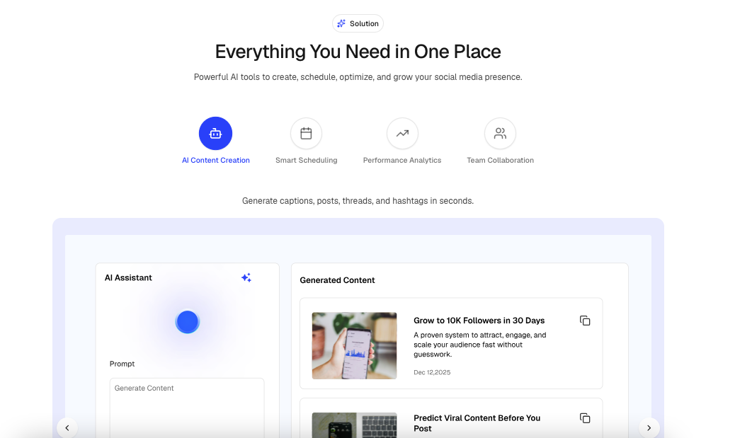
Features
- Auto-rotating tabs
- Progress bar indicator
- Manual tab switching
- Previous / Next navigation
- Mobile horizontal scrolling tabs
- Animated content transitions
- Animated image transitions
- Pause on hover support
- Scroll-triggered activation
- Responsive layout
- Lucide icon support
- Next.js image optimization
Usage
import {
  BarChart3,
  ShieldCheck,
  Zap,
} from "lucide-react";

<FeatureTabs
  heading="Powerful Features"
  subheading="Everything you need to scale your business."
  badge={{
    title: "Features",
  }}
  tabs={[
    {
      id: "analytics",
      title: "Analytics",
      description:
        "Track performance with detailed reports and real-time insights.",
      icon: BarChart3,
      image: "/images/analytics.png",
    },
    {
      id: "security",
      title: "Security",
      description:
        "Protect your data with enterprise-grade security.",
      icon: ShieldCheck,
      image: "/images/security.png",
    },
    {
      id: "automation",
      title: "Automation",
      description:
        "Automate workflows and save valuable time.",
      icon: Zap,
      image: "/images/automation.png",
    },
  ]}
/>
Props
interface FeatureTabItem {
  id: string;
  title: string;
  description: string;
  icon: LucideIcon;
  image?: string;
}

interface FeatureTabsProps {
  heading?: string;

  subheading?: string;

  badge?: {
    title: string;
    icon?: LucideIcon;
  };

  tabs: readonly FeatureTabItem[];

  autoSlide?: boolean;

  ProgressBarDuration?: number;

  showProgressBar?: boolean;

  showNavigationBtn?: boolean;

  pauseOnHover?: boolean;

  className?: string;
}
Tab Item Structure
{
  id: "analytics",
  title: "Analytics",
  description:
    "Track performance with detailed reports and real-time insights.",
  icon: BarChart3,
  image: "/images/analytics.png"
}
Auto Slide
Automatically rotates between tabs.
<FeatureTabs
  autoSlide={true}
  tabs={tabs}
/>
Disable automatic rotation:
<FeatureTabs
  autoSlide={false}
  tabs={tabs}
/>
Progress Bar
Displays a progress indicator showing when the next tab will appear.
<FeatureTabs
  showProgressBar={true}
  tabs={tabs}
/>
Hide progress bar:
<FeatureTabs
  showProgressBar={false}
  tabs={tabs}
/>
Progress Duration
Controls how long each tab remains active before changing.
<FeatureTabs
  ProgressBarDuration={5000}
  tabs={tabs}
/>
Example durations:
3000 // 3 seconds
5000 // 5 seconds
8000 // 8 seconds
10000 // 10 seconds
Navigation Buttons
Show previous and next controls.
<FeatureTabs
  showNavigationBtn={true}
  tabs={tabs}
/>
Hide navigation buttons:
<FeatureTabs
  showNavigationBtn={false}
  tabs={tabs}
/>
Pause On Hover
Pause automatic tab rotation when hovering over the content panel.
<FeatureTabs
  pauseOnHover={true}
  tabs={tabs}
/>
Disable pause behavior:
<FeatureTabs
  pauseOnHover={false}
  tabs={tabs}
/>
Badge Example
import { Sparkles } from "lucide-react";

<FeatureTabs
  badge={{
    title: "Why Choose Us",
    icon: Sparkles,
  }}
  tabs={tabs}
/>
With Heading & Description
<FeatureTabs
  heading="Built for Modern Teams"
  subheading="Manage projects, automate workflows, and scale faster."
  tabs={tabs}
/>
Example Data
import {
  BarChart3,
  ShieldCheck,
  Zap,
} from "lucide-react";

const tabs = [
  {
    id: "analytics",
    title: "Analytics",
    description:
      "Track performance with detailed reports and real-time insights.",
    icon: BarChart3,
    image: "/images/analytics.png",
  },
  {
    id: "security",
    title: "Security",
    description:
      "Protect your data with enterprise-grade security.",
    icon: ShieldCheck,
    image: "/images/security.png",
  },
  {
    id: "automation",
    title: "Automation",
    description:
      "Automate workflows and save valuable time.",
    icon: Zap,
    image: "/images/automation.png",
  },
];
Common Use Cases
- SaaS Landing Pages
- Product Feature Showcases
- Startup Websites
- Mobile App Presentations
- Product Tours
- Onboarding Experiences
- Marketing Pages
- Feature Demonstrations
- Dashboard Highlights
- Documentation Homepages