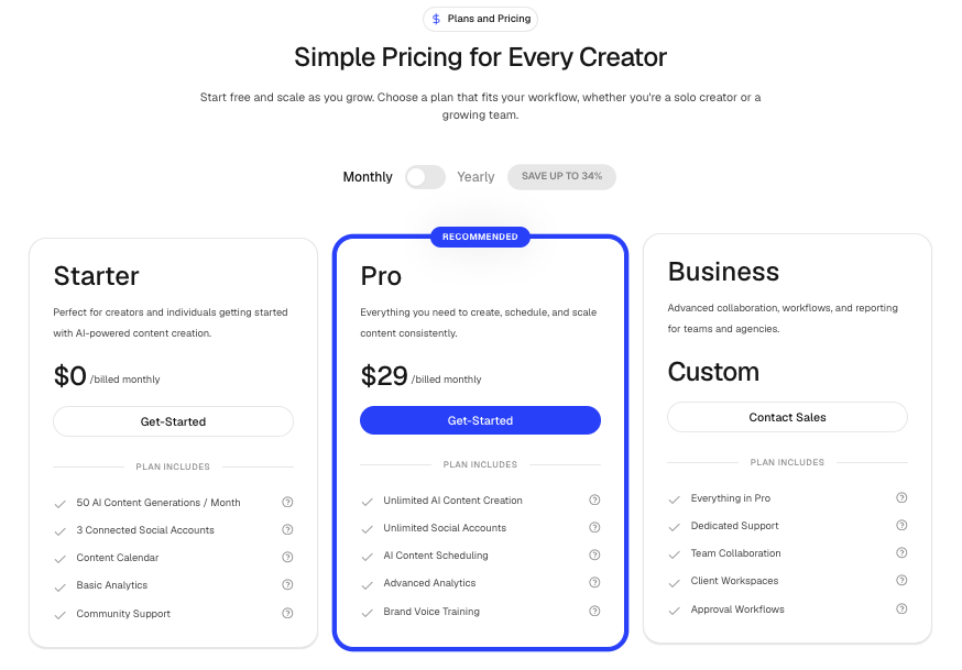
PricingCards
A flexible pricing section designed for SaaS products, startups, membership websites, and subscription-based applications.
It supports billing toggles, highlighted plans, animated pricing transitions, custom feature icons, tooltips, and responsive layouts out of the box.
Features
- Monthly and yearly billing toggle
- Animated pricing transitions
- Highlighted plan support
- Feature tooltips
- Custom feature icons
- Custom CTA buttons
- Responsive layout
- Motion animations
- Validation for supported pricing configurations
- Supports 1–3 pricing plans
Import the component using:
import PricingCards from "@/components/ui/pricingCards";Preview
Props
interface Feature {
  label: string;
  tooltip?: string;

  icon?: LucideIcon;
  iconColor?: string;
  iconFill?: string;
  iconStrokeWidth?: number;
}

interface SectionBadge {
  title: string;
  icon?: LucideIcon;
  iconFill?: string;
}

interface Plan {
  title: string;
  description: string;

  monthlyPrice: number | string;
  yearlyPrice?: number | string;

  ctaLabel?: string;
  ctaHref?: string;

  features: Feature[];

  highlighted?: boolean;
  highlightLabel?: string;
}

interface PricingProps {
  heading: string;
  subheading: string;

  badge?: SectionBadge;

  plans: Plan[];

  yearlyDiscountBadge?: string;

  suffix: string;
  currency: string;

  defaultBilling?: "monthly" | "yearly";

  featureIcon?: LucideIcon;
  featureIconColor?: string;
  featureIconFill?: string;
  featureIconStrokeWidth?: number;
}
Basic Example
import PricingCards from "@/components/ui/pricing-cards";
import { Rocket, Shield, Zap } from "lucide-react";

export default function PricingDemo() {
  return (
    <PricingCards
      heading="Simple Pricing"
      subheading="Choose the plan that fits your business."
      currency="$"
      suffix="/month"
      plans={[
        {
          title: "Starter",
          description: "Perfect for small projects.",
          monthlyPrice: 19,
          yearlyPrice: 15,
          ctaLabel: "Get Started",
          features: [
            { label: "Unlimited Projects" },
            { label: "Email Support" }
          ]
        },
        {
          title: "Pro",
          description: "Built for growing teams.",
          monthlyPrice: 49,
          yearlyPrice: 39,
          highlighted: true,
          highlightLabel: "Most Popular",
          ctaLabel: "Start Free Trial",
          features: [
            { label: "Unlimited Projects" },
            { label: "Priority Support" },
            { label: "Advanced Analytics" }
          ]
        },
        {
          title: "Enterprise",
          description: "Custom solutions for large organizations.",
          monthlyPrice: "Custom",
          ctaLabel: "Contact Sales",
          features: [
            { label: "Dedicated Support" },
            { label: "Custom Integrations" }
          ]
        }
      ]}
    />
  );
}
With Badge
import { CreditCard } from "lucide-react";

<PricingCards
  heading="Pricing"
  subheading="Simple and transparent pricing."
  badge={{
    title: "Plans",
    icon: CreditCard,
  }}
  currency="$"
  suffix="/month"
  plans={plans}
/>
Highlighted Plan
Use highlighted to emphasize a recommended pricing tier.
{
  title: "Pro",
  monthlyPrice: 49,
  yearlyPrice: 39,
  highlighted: true,
  highlightLabel: "Most Popular"
}
Only one plan can be highlighted at a time.
Custom Feature Tooltips
Tooltips help explain feature availability.
{
  label: "Advanced Analytics",
  tooltip: "Includes conversion tracking, funnels, and attribution reports."
}
Custom Feature Icons
{
  label: "Unlimited Storage",
  icon: Shield,
  iconColor: "text-green-500"
}
You can also provide global defaults:
<PricingCards
  featureIcon={Zap}
  featureIconColor="text-primary"
  featureIconStrokeWidth={2.5}
  {...props}
/>
Billing Options
Monthly
defaultBilling="monthly"Yearly
defaultBilling="yearly"Custom Discount Badge
yearlyDiscountBadge="Save 40%"Plan Structure
const plans = [
  {
    title: "Starter",
    description: "For individuals",

    monthlyPrice: 19,
    yearlyPrice: 15,

    ctaLabel: "Get Started",
    ctaHref: "/signup",

    highlighted: false,

    features: [
      {
        label: "Unlimited Projects",
        tooltip: "Create as many projects as needed"
      }
    ]
  }
];
Validation Rules
The component validates pricing configuration automatically.
Supported
1 Plan
2 Plans
3 Plans
Unsupported
4+ Plans
Multiple highlighted plans
Violations will throw runtime errors.
Recommended Use Cases
- SaaS Pricing Pages
- Startup Landing Pages
- Subscription Products
- Membership Platforms
- Agency Packages
- Product Comparison Pages
- Enterprise Sales Pages
Notes
- Supports both numeric and custom pricing values.
- Numeric prices animate during billing changes.
- String values such as
"Custom"or"Contact Sales"render without animation. - Works seamlessly with Lucide Icons.
- Fully responsive on mobile and desktop.
- Built with Framer Motion and Tailwind CSS.