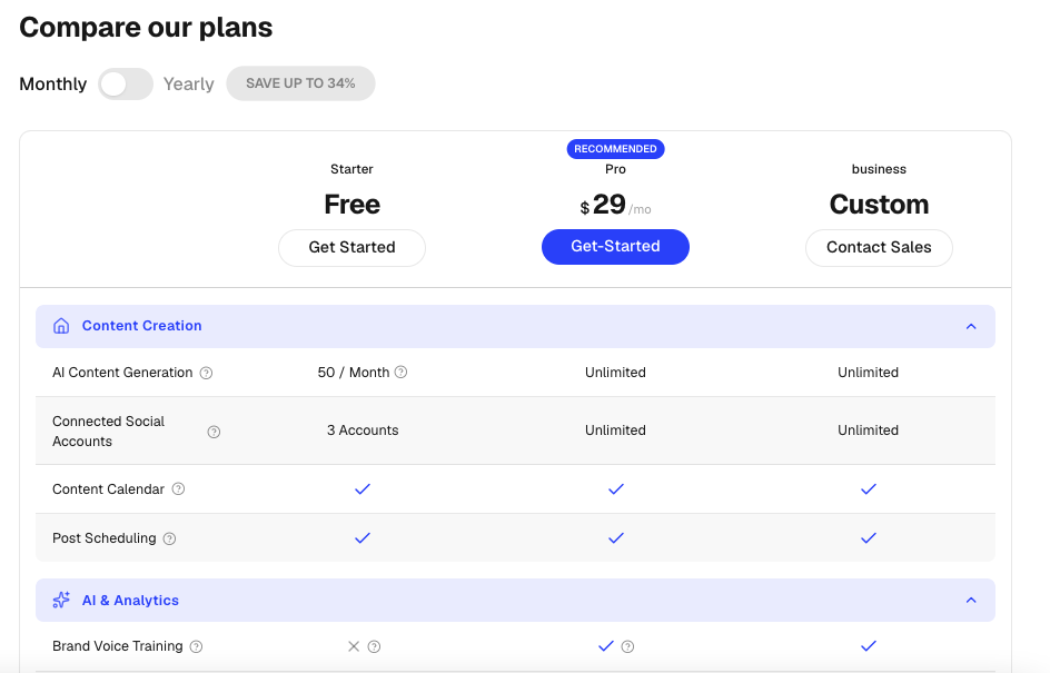
PricingTable
A responsive feature comparison table for showcasing subscription plans side-by-side.
Perfect for SaaS pricing pages, product comparisons, and enterprise feature breakdowns.
Features
- Monthly / yearly billing toggle
- Animated price transitions
- Collapsible feature categories
- Feature tooltips
- Cell value tooltips
- Highlighted plan support
- Mobile horizontal scrolling
- Accessible keyboard interactions
- Smooth Framer Motion animations
- Supports up to 3 plans
- Boolean, text, and custom value rendering
- Custom CTA buttons per plan
Import the component using:
import PricingTable from "@/components/ui/pricingTable";Preview
Basic Example
import PricingTable from "@/components/ui/pricingTable";
import {
  Shield,
  Users,
  Zap,
} from "lucide-react";

export default function Example() {
  return (
    <PricingTable
      title="Compare Plans"
      currency="$"
      suffix="/mo"
      yearlySavingsBadge="Save 25%"
      plans={[
        {
          id: "starter",
          name: "Starter",
          monthlyPrice: 9,
          yearlyPrice: 7,
          ctaLabel: "Get Started",
        },
        {
          id: "pro",
          name: "Pro",
          monthlyPrice: 29,
          yearlyPrice: 24,
          highlighted: true,
          highlightLabel: "Most Popular",
          ctaLabel: "Start Free Trial",
        },
        {
          id: "enterprise",
          name: "Enterprise",
          monthlyPrice: "Custom",
          ctaLabel: "Contact Sales",
        },
      ]}
      sections={[
        {
          id: "core",
          title: "Core Features",
          icon: Zap,
          features: [
            {
              id: "projects",
              label: "Projects",
              values: ["3", "Unlimited", "Unlimited"],
            },
            {
              id: "storage",
              label: "Storage",
              values: ["5GB", "100GB", "Unlimited"],
            },
          ],
        },
        {
          id: "security",
          title: "Security",
          icon: Shield,
          features: [
            {
              id: "sso",
              label: "SSO",
              values: [false, true, true],
            },
            {
              id: "audit",
              label: "Audit Logs",
              values: [false, false, true],
            },
          ],
        },
        {
          id: "team",
          title: "Team Management",
          icon: Users,
          features: [
            {
              id: "members",
              label: "Team Members",
              values: ["3", "25", "Unlimited"],
            },
          ],
        },
      ]}
    />
  );
}
Props
PricingTableProps
interface PricingTableProps {
  /**
   * Table heading
   */
  title?: string;

  /**
   * Pricing plans (recommended: 1–3 plans)
   */
  plans?: Plan[];

  /**
   * Feature comparison sections
   */
  sections?: Section[];

  /**
   * Shows monthly/yearly billing switch
   */
  showBillingToggle?: boolean;

  /**
   * Yearly savings badge text
   */
  yearlySavingsBadge?: string | null;

  /**
   * Currency symbol
   */
  currency?: string;

  /**
   * Price suffix
   * Example: "/mo", "/month"
   */
  suffix?: string;
}
Plan Type
interface Plan {
  id: string;
  name: string;
  monthlyPrice: number | string;
  yearlyPrice?: number | string;

  ctaLabel: string;
  ctaHref?: string;

  highlighted?: boolean;
  highlightLabel?: string;
}
Example
{
  id: "pro",
  name: "Pro",
  monthlyPrice: 29,
  yearlyPrice: 24,
  ctaLabel: "Start Trial",
  ctaHref: "/signup",
  highlighted: true,
  highlightLabel: "Most Popular",
}
Section Type
interface Section {
  id: string;
  title: string;
  icon?: React.ComponentType;
  features: Feature[];
}
Example
{
  id: "security",
  title: "Security",
  icon: Shield,
  features: [...]
}
Feature Type
interface Feature {
  id: string;
  label: string;
  tooltip?: string;
  values: Array<CellValueType | any>;
}
Example
{
  id: "storage",
  label: "Storage",
  tooltip: "Available storage per workspace",
  values: ["5GB", "100GB", "Unlimited"]
}
Cell Values
PricingTable supports multiple value types.
Boolean Values
{
  values: [true, true, false]
}
Renders:
- Check icon for
true - X icon for
false
Text Values
{
  values: [
    "5GB",
    "100GB",
    "Unlimited"
  ]
}
Values With Tooltips
{
  values: [
    {
      val: "10",
      tooltip: "Maximum users allowed"
    },
    {
      val: "50",
      tooltip: "Maximum users allowed"
    },
    {
      val: "Unlimited"
    }
  ]
}
Billing Toggle
Enable or disable the billing switch.
<PricingTable
  showBillingToggle={false}
/>
Custom Savings Badge
<PricingTable
  yearlySavingsBadge="Save 40%"
/>
Highlighted Plan
Only one plan should be highlighted.
{
  id: "pro",
  name: "Pro",
  highlighted: true,
  highlightLabel: "Recommended"
}
Custom Currency
<PricingTable
  currency="€"
/>
Custom Suffix
<PricingTable
  suffix="/month"
/>
Enterprise Pricing Example
{
  id: "enterprise",
  name: "Enterprise",
  monthlyPrice: "Custom",
  ctaLabel: "Contact Sales"
}
String values render without currency symbols.
Validation Rules
Supported Plans
1-3 plansThe component is optimized for a maximum of three plans.
Highlighted Plans
Only one highlighted planAvoid highlighting multiple plans simultaneously.
Accessibility
- Keyboard accessible tooltips
- Accessible billing toggle
- Proper button semantics
- Collapsible sections expose expanded state
- Mobile-friendly scrolling experience
Best Practices
- Keep plan count between 2 and 3
- Group related features into sections
- Use tooltips for complex feature descriptions
- Highlight only one recommended plan
- Use yearly pricing to showcase savings
- Keep feature labels concise
- Use icons for section recognition
Ideal Use Cases
- SaaS pricing pages
- API pricing comparisons
- Subscription businesses
- Membership platforms
- Enterprise software comparisons
- Product feature matrices
- Service tier comparisons