ProcessList
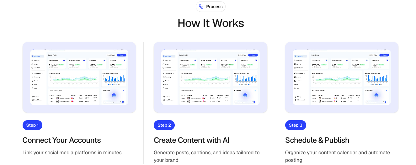
A visual process section for showcasing workflows, onboarding journeys, product steps, and implementation guides.
Each process item includes an image, title, description, and step identifier with smooth entrance animations powered by Motion.
Features
- Animated step-by-step process display
- Responsive multi-column layout
- Image support for every step
- Optional section badge
- Configurable content alignment
- Smooth staggered animations
- Mobile-friendly layout
- Built with Motion and Next.js Image
Import the component using:
import ProcessList from "@/components/ui/processList";Preview
Basic Example
import ProcessList from "@/components/ui/processList";
import { Rocket } from "lucide-react";

export default function Example() {
  return (
    <ProcessList
      badge={{
        title: "Simple Process",
        icon: Rocket,
      }}
      heading="How it works"
      subheading="Launch your project in three simple steps."
      align="center"
      items={[
        {
          id: "01",
          title: "Create Account",
          description:
            "Sign up and create your workspace in minutes.",
          image: "/images/process/account.png",
        },
        {
          id: "02",
          title: "Customize",
          description:
            "Configure your project and invite your team.",
          image: "/images/process/customize.png",
        },
        {
          id: "03",
          title: "Launch",
          description:
            "Go live and start delivering value.",
          image: "/images/process/launch.png",
        },
      ]}
    />
  );
}
Props
ProcessProps
interface ProcessProps {
  /**
   * Main section heading
   */
  heading?: string;

  /**
   * Optional supporting text above the process
   */
  subheading?: string;


  /**
   * Process steps
   */
  items: ProcessItem[];

  /**
   * Optional section badge
   */
  badge?: ProcessBadge;

  /**
   * Content alignment
   * @default "center"
   */
  align?: "left" | "center" | "right";

  /**
   * Additional Tailwind classes
   */
  className?: string;
}
ProcessItem
interface ProcessItem {
  /**
   * Step identifier
   * Example: "01", "02", "03"
   */
  id: string;

  /**
   * Step title
   */
  title: string;

  /**
   * Step description
   */
  description: string;

  /**
   * Step image
   */
  image: string;
}
ProcessBadge
interface ProcessBadge {
  /**
   * Badge text
   */
  title: string;

  /**
   * Optional Lucide icon
   */
  icon?: LucideIcon;
}
Alignment
Left Alignment
<ProcessList
  align="left"
  items={items}
/>
Center Alignment
<ProcessList
  align="center"
  items={items}
/>
Right Alignment
<ProcessList
  align="right"
  items={items}
/>
With Badge
import { Sparkles } from "lucide-react";

<ProcessList
  badge={{
    title: "Getting Started",
    icon: Sparkles,
  }}
  items={items}
/>;
Process Item Example
{
  id: "01",
  title: "Connect Your Data",
  description:
    "Import your existing data sources and synchronize them automatically.",
  image: "/images/process/data-sync.png"
}
Best Practices
- Keep process steps between 3 and 6 items.
- Use consistent image dimensions.
- Keep titles short and descriptive.
- Use step IDs such as
01,02,03for clarity. - Use high-quality screenshots or illustrations.
- Keep descriptions concise and action-oriented.
Accessibility
- Images include alt text using the step title.
- Motion animations only enhance presentation.
- Semantic headings improve screen reader navigation.
- Fully responsive across device sizes.
Ideal Use Cases
- Product onboarding
- SaaS setup flows
- Customer journeys
- Feature walkthroughs
- Implementation guides
- Service processes
- Marketing landing pages
- Workflow explanations