ProcessTimeline
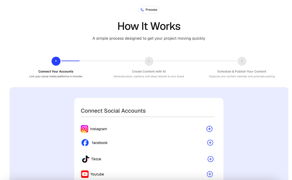
An interactive timeline component for showcasing workflows, onboarding journeys, product lifecycles, implementation guides, and multi-step experiences.
It features an animated desktop timeline with automatic progression and a mobile-friendly stacked layout. Each step can display either an image or custom React content.
Features
- Interactive desktop timeline navigation
- Responsive mobile stacked layout
- Automatic step progression
- Animated progress bar
- Pause on hover support
- Optional infinite looping
- Image or custom React content per step
- Animated content transitions
- Clickable timeline navigation
- Configurable header alignment
- Optional section badge
- Built with Motion and Next.js Image
Import the component using:
import ProcessTimeline from "@/components/ui/processTimeline";Preview
Basic Example
import ProcessTimeline from "@/components/ui/processTimeline";
import { Rocket } from "lucide-react";

export default function Example() {
  return (
    <ProcessTimeline
      badge={{
        title: "Getting Started",
        icon: Rocket,
      }}
      heading="Launch your project"
      subheading="Follow these simple steps to get started."

      alignment="center"

      autoSlideTimeline

      autoSlideDuration={4000}

      pauseOnHover

      autoSlideLoop

      steps={[
        {
          id: "01",
          title: "Create Account",
          description:
            "Sign up and create your workspace.",

          image: "/images/process/account.png",
        },

        {
          id: "02",
          title: "Customize",

          description:
            "Configure your project settings.",

          image: "/images/process/customize.png",
        },

        {
          id: "03",

          title: "Launch",

          description:
            "Publish and go live.",

          image: "/images/process/launch.png",
        },
      ]}
    />
  );
}
Props
ProcessTimelineProps
interface ProcessTimelineProps {
  /**
   * Optional section badge
   */
  badge?: SectionBadge;

  /**
   * Main section heading
   */
  heading: string;

  /**
   * Supporting text
   */
  subheading?: string;

  /**
   * Header alignment
   * @default "center"
   */
  alignment?: "left" | "center" | "right";

  /**
   * Timeline steps
   */
  steps: ProcessStep[];

  /**
   * Automatically move through steps
   * @default true
   */
  autoSlideTimeline?: boolean;

  /**
   * Duration per slide (ms)
   * @default 4000
   */
  autoSlideDuration?: number;

  /**
   * Pause animation on hover
   * @default true
   */
  pauseOnHover?: boolean;

  /**
   * Restart after last step
   * @default true
   */
  autoSlideLoop?: boolean;

  /**
   * Additional Tailwind classes
   */
  className?: string;
}
ProcessStep
interface ProcessStep {
  /**
   * Unique identifier
   */
  id: string;

  /**
   * Step title
   */
  title: string;

  /**
   * Step description
   */
  description: string;

  /**
   * Optional image
   */
  image?: string;

  /**
   * Optional custom React content
   */
  content?: ReactNode;
}
SectionBadge
interface SectionBadge {
  /**
   * Badge text
   */
  title: string;

  /**
   * Optional Lucide icon
   */
  icon?: LucideIcon;
}
Alignment
Left Alignment
<ProcessTimeline
  alignment="left"
  steps={steps}
/>
Center Alignment
<ProcessTimeline
  alignment="center"
  steps={steps}
/>
Right Alignment
<ProcessTimeline
  alignment="right"
  steps={steps}
/>
Auto Slide
Enable Auto Slide
<ProcessTimeline
  autoSlideTimeline
  steps={steps}
/>
Disable Auto Slide
<ProcessTimeline
  autoSlideTimeline={false}
  steps={steps}
/>
Auto Slide Duration
<ProcessTimeline
  autoSlideDuration={5000}
  steps={steps}
/>
Pause On Hover
<ProcessTimeline
  pauseOnHover
  steps={steps}
/>
Loop Behavior
Infinite Loop
<ProcessTimeline
  autoSlideLoop
  steps={steps}
/>
Stop At Final Step
<ProcessTimeline
  autoSlideLoop={false}
  steps={steps}
/>
With Badge
import { Sparkles } from "lucide-react";

<ProcessTimeline
  badge={{
    title: "Implementation Flow",
    icon: Sparkles,
  }}

  steps={steps}
/>;
Step With Image
{
  id: "01",

  title: "Connect Data",

  description:
    "Import and synchronize your data.",

  image: "/images/process/data-sync.png"
}
Step With Custom Content
//content/marketing/process.tsx
{
  id: "02",

  title: "Custom UI",

  description:
    "Render your own React content.",

  content: (
    <div className="text-center">
      <h4>Custom Content</h4>

      <p>
        Any React component can be rendered.
      </p>
    </div>
  )
}
Best Practices
- Keep timelines between 3 and 6 steps.
- Use concise and action-oriented titles.
- Use consistent image dimensions.
- Use high-quality illustrations or screenshots.
- Keep descriptions brief and readable.
- Use
autoSlideDurationbetween 3000 and 6000 milliseconds. - Avoid excessive custom content within steps.
- Use badges to provide additional context.
Accessibility
- Semantic headings improve screen reader navigation.
- Images include alt text using the step title.
- Motion animations only enhance presentation.
- Clickable steps remain accessible.
- Fully responsive across all device sizes.
Ideal Use Cases
- Product onboarding
- SaaS setup flows
- User journeys
- Feature walkthroughs
- Implementation guides
- Customer onboarding
- Marketing landing pages
- Workflow explanations
- Product lifecycles
- Interactive tutorials
- Service processes