SocialIcon
A lightweight and reusable social media icon component designed for displaying social links across websites and applications.
It supports multiple social platforms, customizable sizing, theme-aware colors, hover animations, and optional external link behavior while maintaining a simple and consistent API.
Features
- Multiple social platform support
- Type-safe platform selection
- Scalable SVG icons
- Custom icon sizing
- Theme-aware color support
- Hover scale animation
- External link support
- Open links in new tabs
- Lightweight SVG implementation
- Fully responsive
- Tailwind CSS friendly
Import the component using:
import SocialIcon from "@/components/ui/socialIcons";Preview
Basic Example
import SocialIcon from "@/components/ui/socialIcon";

export default function Example() {
  return (
    <SocialIcon
      type="github"
      href="https://github.com"
    />
  );
}
Props
SocialIconProps
interface SocialIconProps {
  /**
   * Social platform
   */
  type: SocialType;

  /**
   * Link destination
   */
  href?: string;

  /**
   * Icon size in pixels
   *
   * @default 24
   */
  iconSize?: number;

  /**
   * Tailwind text color class
   *
   * @default "text-foreground"
   */
  color?: string;

  /**
   * Additional classes
   */
  className?: string;

  /**
   * Open link in new tab
   *
   * @default true
   */
  openInNewTab?: boolean;
}
SocialType
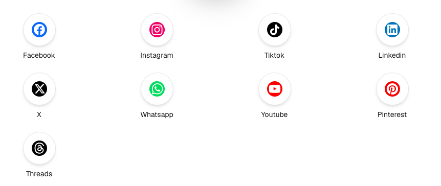
type SocialType =
  | "facebook"
  | "x"
  | "linkedin"
  | "youtube"
  | "instagram"
  | "github"
  | "google"
  | "tiktok"
  | "pinterest";
GitHub Icon
<SocialIcon
  type="github"
  href="https://github.com"
/>
LinkedIn Icon
<SocialIcon
  type="linkedin"
  href="https://linkedin.com"
/>
X (Twitter) Icon
<SocialIcon
  type="x"
  href="https://x.com"
/>
Instagram Icon
<SocialIcon
  type="instagram"
  href="https://instagram.com"
/>
Custom Size
<SocialIcon
  type="github"
  iconSize={40}
  href="https://github.com"
/>
Custom Color
<SocialIcon
  type="linkedin"
  color="text-primary"
  href="https://linkedin.com"
/>
Without Opening New Tab
<SocialIcon
  type="facebook"
  href="/about"
  openInNewTab={false}
/>
Custom Styling
<SocialIcon
  type="instagram"
  href="https://instagram.com"
  className="hover:rotate-6"
/>
Social Links Group
<div className="flex items-center gap-4">
  <SocialIcon
    type="github"
    href="https://github.com"
  />

  <SocialIcon
    type="linkedin"
    href="https://linkedin.com"
  />

  <SocialIcon
    type="x"
    href="https://x.com"
  />

  <SocialIcon
    type="instagram"
    href="https://instagram.com"
  />
</div>
Supported Platforms
[
  "facebook",
  "x",
  "linkedin",
  "youtube",
  "instagram",
  "github",
  "google",
  "tiktok",
  "pinterest"
]
Best Practices
- Use recognizable brand colors when appropriate.
- Keep icon sizes consistent within a section.
- Add sufficient spacing between icons.
- Use external links for social profiles.
- Use hover effects sparingly.
- Group related social icons together.
- Provide meaningful destinations for each icon.
Accessibility
- Uses semantic anchor elements.
- Supports keyboard navigation.
- Icons inherit color for better theme compatibility.
- External links include proper security attributes.
- SVG icons remain sharp at all sizes.
- Responsive across all screen sizes.
Ideal Use Cases
- Website footers
- Team member profiles
- Author pages
- Marketing websites
- SaaS applications
- Landing pages
- Contact sections
- Community pages
- Documentation websites
- Social media link groups
Notes
- All icons are rendered as inline SVGs.
- Icons automatically inherit the current text color using
currentColor. - Hover scaling is enabled by default.
- Links open in a new tab unless
openInNewTab={false}is provided. - Tailwind utility classes can be applied through both
colorandclassName.