TeamCard
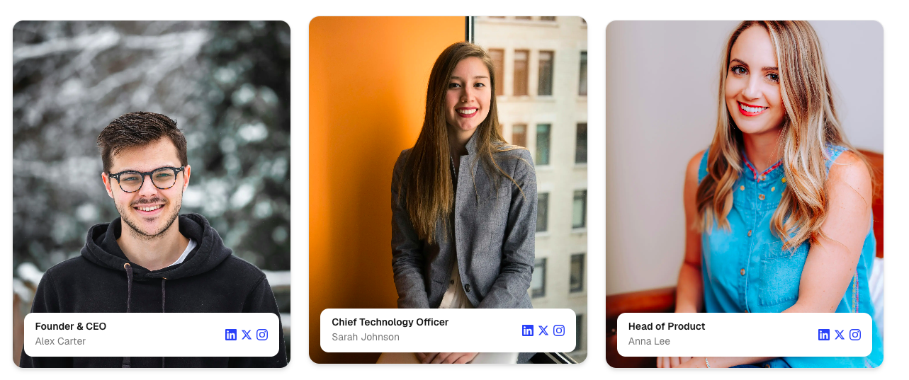
A modern team member card designed for showcasing employees, founders, contributors, advisors, and leadership teams.
It features a large portrait image, a floating information card overlay, optional social media links, responsive layouts, and smooth hover animations for an engaging team section experience.
Features
- Large portrait image
- Floating information card overlay
- Displays member role and name
- Optional social media links
- Smooth hover animations
- Responsive design
- Built with Motion
- Optimized Next.js Image support
- Multiple social platform support
- Customizable styling
- Clean modern layout
Import the component using:
import TeamCard from "@/components/ui/teamCard";Preview
Basic Example
import TeamCard from "@/components/ui/teamCard";

export default function Example() {
  return (
    <TeamCard
      name="John Doe"

      role="Founder & CEO"

      image="/images/team/john.jpg"
    />
  );
}
Props
TeamCardProps
interface TeamCardProps {
  /**
   * Team member name
   */
  name: string;

  /**
   * Team member role
   */
  role: string;

  /**
   * Portrait image
   */
  image: string;

  /**
   * Optional social links
   */
  socialLinks?: {
    linkedin?: string;
    x?: string;
    instagram?: string;
    github?: string;
    facebook?: string;
    youtube?: string;
    tiktok?: string;
    pinterest?: string;
    google?: string;
  };

  /**
   * Additional Tailwind classes
   */
  className?: string;
}
Simple Team Card
<TeamCard
  name="John Doe"
  role="Founder & CEO"
  image="/images/team/john.jpg"
/>
With Social Links
<TeamCard
  name="Sarah Johnson"

  role="Product Designer"

  image="/images/team/sarah.jpg"

  socialLinks={{
    linkedin:
      "https://linkedin.com/in/sarah",

    x:
      "https://x.com/sarah",

    instagram:
      "https://instagram.com/sarah",
  }}
/>
Full Social Example
<TeamCard
  name="Alex Brown"

  role="Software Engineer"

  image="/images/team/alex.jpg"

  socialLinks={{
    linkedin:
      "https://linkedin.com",

    github:
      "https://github.com",

    x:
      "https://x.com",

    instagram:
      "https://instagram.com",

    youtube:
      "https://youtube.com",

    facebook:
      "https://facebook.com",
  }}
/>
Custom Styling
<TeamCard
  name="John Doe"

  role="Founder"

  image="/images/team/john.jpg"

  className="max-w-sm mx-auto"
/>
Social Links Example
const socialLinks = {
  linkedin:
    "https://linkedin.com/in/johndoe",

  github:
    "https://github.com/johndoe",

  x:
    "https://x.com/johndoe",

  instagram:
    "https://instagram.com/johndoe",

  youtube:
    "https://youtube.com/@johndoe",
};
Team Grid Example
<div className="grid gap-6 md:grid-cols-2 lg:grid-cols-4">
  {teamMembers.map((member) => (
    <TeamCard
      key={member.name}
      name={member.name}
      role={member.role}
      image={member.image}
      socialLinks={member.socialLinks}
    />
  ))}
</div>
Example Data
const teamMembers = [
  {
    name: "John Doe",

    role: "Founder & CEO",

    image: "/images/team/john.jpg",

    socialLinks: {
      linkedin:
        "https://linkedin.com/in/john",
    },
  },

  {
    name: "Sarah Johnson",

    role: "Product Designer",

    image: "/images/team/sarah.jpg",

    socialLinks: {
      linkedin:
        "https://linkedin.com/in/sarah",

      x:
        "https://x.com/sarah",
    },
  },

  {
    name: "Alex Brown",

    role: "Software Engineer",

    image: "/images/team/alex.jpg",

    socialLinks: {
      github:
        "https://github.com/alex",
    },
  },
];
Supported Social Platforms
[
  "linkedin",
  "x",
  "instagram",
  "github",
  "facebook",
  "youtube",
  "tiktok",
  "pinterest",
  "google"
]
Best Practices
- Use professional portrait images.
- Keep names concise and readable.
- Use meaningful role titles.
- Provide only relevant social links.
- Use consistent image dimensions.
- Keep team cards visually consistent.
- Use high-quality images for best results.
- Maintain equal card heights within grids.
Accessibility
- Portrait images include descriptive alt text.
- Social links remain keyboard accessible.
- Hover animations enhance presentation only.
- Fully responsive across all screen sizes.
- Icons remain accessible through standard link navigation.
- Compatible with screen readers.
Ideal Use Cases
- About pages
- Team sections
- Startup websites
- SaaS websites
- Agency websites
- Leadership pages
- Advisor sections
- Contributor showcases
- Community pages
- Company directories
Notes
- Social icons are only rendered when social links are provided.
- The floating information card automatically overlays the image.
- Uses Next.js Image for optimized image loading.
- Hovering slightly elevates the card and zooms the portrait image.
- Integrates seamlessly with the SocialIcon component.