Navbar Component
The Navbar component is the primary navigation system used throughout Pulse AI. It includes support for desktop navigation, dropdown menus, mega menus, mobile navigation, call-to-action buttons, and smooth animations powered by Motion.
Import the component using:
import Navbar from "@/components/layout/navbar";Preview

Features
The Navbar includes:
- Responsive desktop and mobile navigation
- Dropdown menus
- Mega menu support
- Mobile hamburger menu
- Motion animations
- CTA buttons
- Logo integration
- Accessibility-friendly navigation
- Content-driven configuration
Basic Usage
Add the Navbar component to your layout or page:
import Navbar from "@/components/layout/navbar";

export default function RootLayout({
  children,
}: {
  children: React.ReactNode;
}) {
  return (
    <>
      <Navbar />
      {children}
    </>
  );
}
Navigation Configuration
All navigation items are managed from a single file.
Location
content/
└── shared/
    └── navbar.ts
The component automatically reads from:
NAV_LINKSThis makes it easy to update navigation without modifying the component itself.
Adding a Simple Navigation Link
To add a standard navigation item:
export const NAV_LINKS = [
  {
    label: "Pricing",
    href: "/pricing",
  },
];
The item will appear as a direct navigation link in both desktop and mobile menus.
Creating a Dropdown Menu
To create a dropdown menu, add a children array.
{
  label: "Resources",
  children: [
    {
      label: "Blog",
      href: "/blog",
    },
    {
      label: "Documentation",
      href: "/docs",
    },
  ],
}
Dropdown Menu Preview
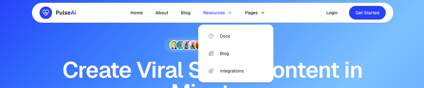
Dropdown Features
- Hover activated on desktop
- Expandable on mobile
- Supports icons
- Automatically animated
Adding Icons to Dropdown Items
You can attach Lucide React icons to dropdown items.
import { BookOpen, Newspaper } from "lucide-react";

{
  label: "Resources",
  children: [
    {
      label: "Documentation",
      href: "/docs",
      icon: BookOpen,
    },
    {
      label: "Blog",
      href: "/blog",
      icon: Newspaper,
    },
  ],
}
Icons are displayed automatically in both desktop and mobile navigation.
Creating a Mega Menu
Mega menus are ideal when you need to organize a large number of links.
import { Home, DollarSign } from "lucide-react"

{
  label: "Components",
  megaMenu: {
    items: [
      {
        title: "Marketing",
        links: [
          {
            label: "Hero Section",
            href: "/components/hero",
            icon: Home
          },
          {
            label: "Pricing Section",
            href: "/components/pricing",
            icon: DollarSign
          },
        ],

      },
    ],
  },
}
Mega Menu Preview
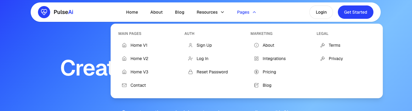
Mega Menu Features
- Multi-column layout
- Category grouping
- Optional icons
- Responsive design
- Mobile collapsible support
CTA Buttons
The navbar CTA buttons are configured from the brand settings.
Location
content/
└── shared/
    └── brand.ts
Example:
export const CTA = {
  primary: {
    label: "Get Started",
    link: "/signup",
  },
  secondary: {
    label: "Login",
    link: "/login",
  },
};
These buttons automatically appear:
- On desktop navigation
- At the bottom of the mobile menu
Logo Integration
The navbar automatically renders the Logo component.
<Logo />Logo Location
components/
└── layout/
    └── logo.tsx
To update your logo, brand name, or highlighted text, edit:
content/shared/brand.tsMobile Navigation
On mobile devices, the navbar automatically transforms into a hamburger menu.
Mobile Features
- Animated hamburger button
- Collapsible dropdowns
- Collapsible mega menus
- Smooth animations
- Auto-close after navigation
- Touch-friendly interactions
No additional configuration is required.
Animations
Pulse AI uses Motion for navigation animations.
Included Animations
- Mobile menu entrance and exit
- Dropdown expansion
- Mega menu expansion
- Chevron rotation
- Smooth transitions
You can customize all animations directly inside:
components/layout/navbar.tsxCommon Customizations
Change Navbar Width
Locate:
max-w-6xlExample:
max-w-7xlChange Navbar Shape
Locate:
rounded-fullExample:
rounded-2xlChange Navbar Position
Current:
fixed top-4Alternative:
sticky top-0Change Mobile Menu Animation
Locate:
initial={{ opacity: 0, y: -20 }}
animate={{ opacity: 1, y: 0 }}
Adjust these values to create your own animation style.
Dependencies
The Navbar component depends on:
npm install motion lucide-react clsxIt also uses:
- Next.js Link
- Logo Component
- Button Component
- NAV_LINKS Configuration
- CTA Configuration
Summary
The Navbar component is fully responsive, content-driven, and highly customizable. Most navigation changes can be made by editing:
content/shared/navbar.tswhile branding and call-to-action settings can be managed from:
content/shared/brand.tswithout modifying the Navbar component itself.