Carousel Card Slider
The CarouselCardSlider component displays a collection of cards in either:
- Infinite marquee mode (desktop)
- Swipeable carousel mode (mobile)
It supports :
- icon cards
- image cards
- auto sliding
- hover actions
- navigation buttons and custom card styling.
Import the component using:
import CarouselCardSlider from "@/components/ui/carouselCardSlider";Preview
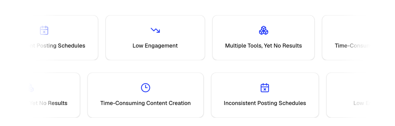
Desktop Marquee Slider
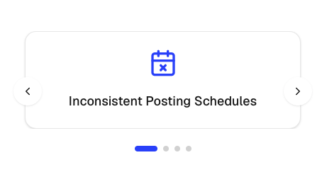
Mobile Slider
Basic Example
import { Zap, Shield, Globe } from "lucide-react";

const items = [
  {
    id: "1",
    title: "Fast Performance",
    icon: Zap,
  },
  {
    id: "2",
    title: "Secure Platform",
    icon: Shield,
  },
  {
    id: "3",
    title: "Global Access",
    icon: Globe,
  },
];

<CarouselCardSlider items={items} />;
Image Cards Example
const items = [
  {
    id: "1",
    image: "/logos/vercel.svg",
    imageAlt: "Vercel",
  },
  {
    id: "2",
    image: "/logos/github.svg",
    imageAlt: "GitHub",
  },
  {
    id: "3",
    image: "/logos/openai.svg",
    imageAlt: "OpenAI",
  },
];

<CarouselCardSlider items={items} />;
Mobile Slider Example
Enable swipeable cards on mobile devices.
<CarouselCardSlider
  items={items}
  mobileSlider
/>
Mobile Auto Slide
Automatically advance slides on mobile.
<CarouselCardSlider
  items={items}
  mobileSlider
  mobileAutoSlide
  mobileAutoSliderDuration={4}
/>
Navigation Buttons
Show previous and next controls for mobile sliders.
<CarouselCardSlider
  items={items}
  mobileSlider
  showNavigationBtns
/>
Hover Behavior
Control what happens when a user hovers over the desktop marquee.
Pause Animation
<CarouselCardSlider
  items={items}
  actionOnHover="pause"
/>
Slow Down Animation
<CarouselCardSlider
  items={items}
  actionOnHover="slow"
/>
No Interaction
<CarouselCardSlider
  items={items}
  actionOnHover="none"
/>
Scroll Direction
Move cards left or right.
Left
<CarouselCardSlider
  items={items}
  scrollDirection="left"
/>
Right
<CarouselCardSlider
  items={items}
  scrollDirection="right"
/>
Speed
Control marquee animation speed.
<CarouselCardSlider
  items={items}
  speed={20}
/>
Higher values result in slower movement.
Item Structure
Icon Card
{
  id: "feature-1",
  title: "Fast Performance",
  icon: Zap
}
Image Card
{
  id: "logo-1",
  image: "/logos/vercel.svg",
  imageAlt: "Vercel"
}
Props
interface CarouselCardSliderProps {
  items: CarouselItem[];

  /**
   * Desktop marquee speed
   */
  speed?: number;

  /**
   * Hover behavior
   * - "slow" = slows animation
   * - "pause" = pauses animation
   * - "none" = no interaction
   */
  actionOnHover?: "slow" | "pause" | "none";

  /**
   * Enable mobile swipe slider
   */
  mobileSlider?: boolean;

  /**
   * Auto advance slides on mobile
   */
  mobileAutoSlide?: boolean;

  /**
   * Auto slide interval in seconds
   */
  mobileAutoSliderDuration?: number;

  /**
   * Marquee direction
   */
  scrollDirection?: "left" | "right";

  /**
   * Show previous/next buttons
   * (mobile slider only)
   */
  showNavigationBtns?: boolean;

  /**
   * Wrapper styling
   */
  className?: string;

  /**
   * Individual card styling
   */
  cardClassName?: string;
}
CarouselItem Type
type CarouselItem = {
  id: string;

  title?: string;
  icon?: LucideIcon;

  image?: string;
  imageAlt?: string;
};
Common Use Cases
- Customer logos
- Partner logos
- Feature highlights
- Product showcases
- Technology stacks
- Testimonials
- Brand carousels
- Infinite scrolling content