Legal Layout Component
The Legal Layout component provides a complete solution for displaying long-form legal documents and documentation pages.
It includes a responsive table of contents, scroll spy functionality, smooth scrolling, active section highlighting, and support for nested content sections.
Import the component using:
import LegalLayout from "@/components/layout/legal_layout";Preview
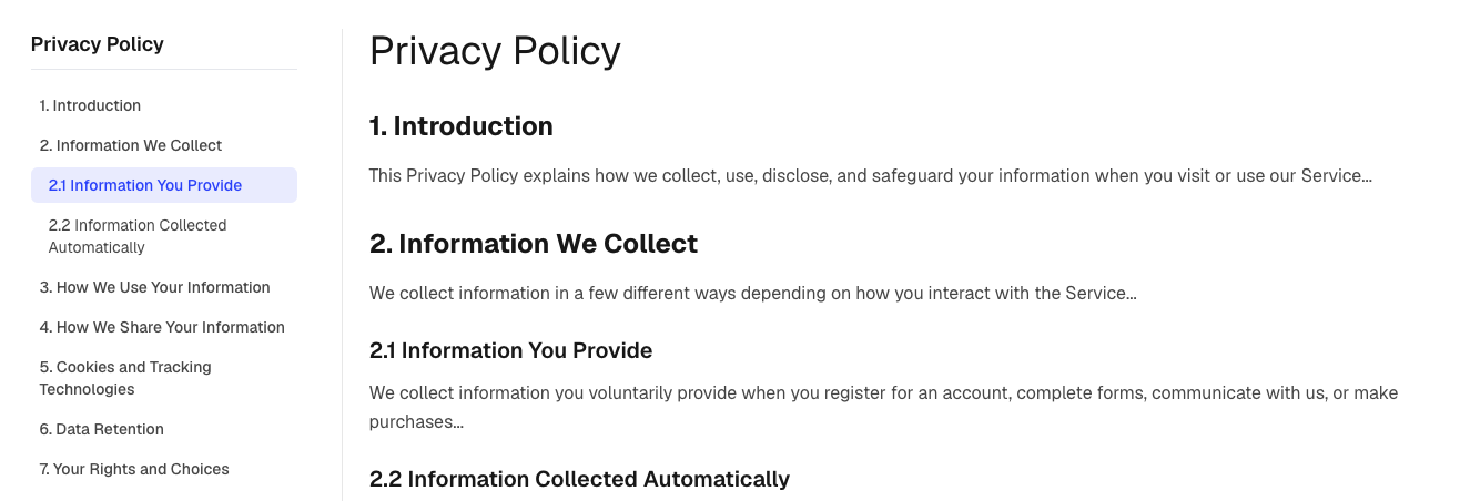
Features
The Legal Layout includes:
- Sticky desktop table of contents
- Mobile dropdown navigation
- Automatic scroll spy
- Active section highlighting
- Smooth scrolling navigation
- Nested sections and subsections
- Responsive design
- Content-driven structure
- Documentation and legal page support
Basic Usage
import LegalLayout from "@/components/layout/legal_layout";
import { termsData } from "@/content/legal/terms";

export default function TermsPage() {
  return (
    <LegalLayout
      title={termsData.title}
      tableOfContents={termsData.tableOfContents}
      mainContent={termsData.mainContent}
    />
  );
}
Data Structure
The component requires two main props:
tableOfContents
mainContent
These must be linked together using matching section IDs.
Table Of Contents Structure
Each table of contents item controls navigation in the sidebar and mobile dropdown.
interface TableOfContentsItem {
  id: string;
  title: string;
  level?: 1 | 2 | 3;
}
Example
const tableOfContents = [
  {
    id: "introduction",
    title: "Introduction",
    level: 1,
  },
  {
    id: "data-collection",
    title: "Data Collection",
    level: 2,
  },
  {
    id: "cookies",
    title: "Cookies",
    level: 3,
  },
];
Level Hierarchy
Level 1 → Main Section
Level 2 → Subsection
Level 3 → Nested Subsection
Example:
Introduction
  Data Collection
    Cookies
Main Content Structure
Each content section must have a matching ID from the table of contents.
interface MainContentSection {
  id: string;
  title: string;
  content: React.ReactNode;
  level?: 1 | 2 | 3;
}
Content Files and JSX
The content field accepts a React.ReactNode, which means you can use JSX such as:
content: (
  <>
    <p>
      Welcome to our Terms and Conditions.
    </p>
  </>
)
Because JSX is being used, the content file must be a .tsx file.
Recommended Structure
content/
└── legal/
    ├── privacy.tsx
    ├── terms.tsx
    └── cookies.tsx
Example:
// content/legal/privacy.tsx

export const privacySections = [
  {
    id: "information-we-collect",
    title: "Information We Collect",
    level: 1 as const,
    content: (
      <p>
        This Privacy Policy explains how we handle your information.
      </p>
    ),
  },
];
Why .tsx?
JSX syntax is only supported inside .tsx files.
The following will cause an error if used inside a .ts file:
export const privacySections = [
  {
    id: "information-we-collect",
    title: "Information We Collect",
    content: (
      <p>
        This Privacy Policy explains how we handle your information.
      </p>
    ),
  },
];
Error:
JSX syntax is not allowed in .ts files.Alternative: Use Plain Strings
If your content file only contains text and no JSX, you can keep it as a .ts file.
Example:
// content/legal/privacy.ts

export const privacySections = [
  {
    id: "information-we-collect",
    title: "Information We Collect",
    level: 1 as const,
    content:
      "This Privacy Policy explains how we handle your information.",
  },
];
This approach works well for simple content but does not support custom formatting or components.
Alternative: Use React.createElement()
If you must keep the file as .ts, you can manually create React elements.
import React from "react";

export const privacySections = [
  {
    id: "information-we-collect",
    title: "Information We Collect",
    level: 1 as const,
    content: React.createElement(
      "p",
      null,
      "This Privacy Policy explains how we handle your information."
    ),
  },
];
While this works, it is harder to read and maintain than JSX.
Recommended Approach
For Pulse AI projects, use:
.tsfor configuration and data files such as:
content/shared/navbar.ts
content/shared/footer.ts
content/shared/brand.ts
and use:
.tsxfor legal or documentation content that contains UI elements such as:
<p>...</p>
<ul>...</ul>
<Button />
<Alert />
Example:
content/legal/privacy.tsx
content/legal/terms.tsx
content/legal/cookies.tsx
This provides the best developer experience and keeps content easy to read and maintain.
Important Requirement
Every table of contents ID must match a content section ID.
Correct:
tableOfContents: [
  {
    id: "privacy",
    title: "Privacy Policy",
  },
];

mainContent: [
  {
    id: "privacy",
    title: "Privacy Policy",
    content: <p>...</p>,
  },
];
Incorrect:
tableOfContents: [
  {
    id: "privacy",
    title: "Privacy Policy",
  },
];

mainContent: [
  {
    id: "terms",
    title: "Terms",
    content: <p>...</p>,
  },
];
The navigation will not work if IDs do not match.
Complete Example
const legalData = {
  title: "Privacy Policy",

  tableOfContents: [
    {
      id: "introduction",
      title: "Introduction",
      level: 1,
    },
    {
      id: "information-we-collect",
      title: "Information We Collect",
      level: 1,
    },
    {
      id: "personal-data",
      title: "Personal Data",
      level: 2,
    },
    {
      id: "cookies",
      title: "Cookies",
      level: 2,
    },
  ],

  mainContent: [
    {
      id: "introduction",
      title: "Introduction",
      level: 1,
      content: (
        <p>
          This Privacy Policy explains how we handle
          your information.
        </p>
      ),
    },

    {
      id: "information-we-collect",
      title: "Information We Collect",
      level: 1,
      content: (
        <p>
          We collect information necessary to provide
          and improve our services.
        </p>
      ),
    },

    {
      id: "personal-data",
      title: "Personal Data",
      level: 2,
      content: (
        <p>
          Personal data may include your name,
          email address, and account information.
        </p>
      ),
    },

    {
      id: "cookies",
      title: "Cookies",
      level: 2,
      content: (
        <p>
          We use cookies to improve functionality
          and user experience.
        </p>
      ),
    },
  ],
};
Creating a Terms Page
Create a content file:
content/
└── legal/
    └── terms.tsx
Export your legal content:
export const termsData = {
  title: "Terms & Conditions",
  tableOfContents: [...],
  mainContent: [...],
};
Then create a page:
import LegalLayout from "@/components/layout/legal_layout";
import { termsData } from "@/content/legal/terms";

export default function TermsPage() {
  return (
    <LegalLayout
      title={termsData.title}
      tableOfContents={termsData.tableOfContents}
      mainContent={termsData.mainContent}
    />
  );
}
Supported Use Cases
The Legal Layout is suitable for:
- Terms & Conditions
- Privacy Policy
- Cookie Policy
- Refund Policy
- Licensing Agreements
- SaaS Agreements
- Documentation Pages
- Knowledge Bases
- Product Guides
- Help Centers
Summary
The Legal Layout component provides a complete framework for long-form content with automatic navigation and responsive layouts.
To use it:
- Create a table of contents.
- Create matching content sections.
- Pass both objects into the component.
As long as the IDs match, the table of contents, scroll spy, active highlighting, and smooth scrolling will work automatically.